 |
 |
- About Vista web buttons
- Quick-start tutorial
- Creating website buttons
- Adjusting web menu appearance
- Setting javascript rollover buttons links
- Creating buttons - sub menus
- Adjusting javascript rollover button
- Setting sub menu buttons links
- Saving vista buttons
- Cascade graphics user guide
- Main window
- Toolboxes
- Animated gif image themes toolbox
- Button generator submenu toolbox
- Properties toolbox - main buttons
- Properties toolbox - submenus
- Create buttons in theme editor
- Creating theme tutorial
- Java script button states
- Creating new html image button
- Adding graphics and images to the theme
- Setting gif buttons state images
- Adjusting play buttons edges width
- Cool buttons samples
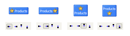
Normal/Hot state of button gif
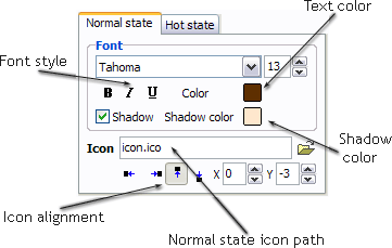
"Normal state" and "Hot state" tabs define how button responds to the mouse events. Icon alignment is defined also. You can select text font, font size, font style (bold, italic, and underlined) and so on for each button state separately.
Button is in Normal state when the mouse cursor is not over the button.
Button is in Hot state when the mouse cursor is over the button.
Button is in Pressed state when it is clicked or pressed.
On the "Normal state" tab you can define the button properties when it is in normal state if the menu type is "2-state", "3-state" or "3-state toggle". If the menu type is "1-state" then animated web buttons will always be displayed as in Normal state.
On the "Hot state" tab you can define the button properties when it is in hot and pressed states. Note, that properties changes on this tab will not affect the button if the menu is of "1-state" type.
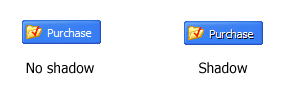
Shadow - set this property for the button's text shadow to be displayed.
Icon - in the Icon field you can enter file name of the icon you want the button to have. Also, you can click the "Open icon" button next to the "Icon" field to select the icon. If you don't want the icon to be displayed any more, just clear the "Icon" field.
Icon alignment - defines the icon position inside the button.